
 USA
USA EU
EU Korea
KoreaOut with the old, in with the new
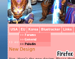 Yep. Here's the new design (no, I'm not kidding!). Please throw some comments of what you think of it!
I'm fixing some stuff that I couldn't see when tooling around on my harddrive.
Preliminary logotype (no title on it). I haven't asked for permission of it yet - going to replace it soon. Reason I took it cause it was a cool pic.
Also, just so you guys know, the website looks absolutely smokin' on a web browser that has CSS text-shadow support. I mean, it's like night and day! I've really, really, really abused text-shadow...
posted by Mastgrr at 9:35:00 AM
![]()
![]()
23 Comments:
ermmm ... pink ..
its err, bright :P
It's Pink!
This is way worse on the eyes. The last design was fine- great infact.
Don't fix something thats not broke.
Go back the old design. PLEASE!
The pink is way too bright, painful to read the text.
Being friend of SFW (Safe for work) websites, I whould say this isnt very good. I really like the clean white, even if the pink does have some pala meaning. Sure, no porn on your website, but these colors are seen half an office away, and they can definetly see it isnt work related.
<3 Pages with lots of white and bright (non agressive) colors.
Your new colors wont discourage me (much) from keep visiting though ;)
I'll town down the pink.
The reason why I went for colors on the redesign was cause the old one was white and boring, and the fact that people just didn't like the extreme contrast between black and white. Especially when switching between the WoW forums and this blog.
you took down the "cadiam response" thing 266 days since bla bla bla i loved it cuz it reminded me of how much blizz sucks lol. maby go with a holy cruzader color scheme if youre gonna change it or a judgment color scheme that would rule.
Mastgrr please just go back to what it was.
It never bothered me personally going from the WoW forums to your blog; black to pink isn't going to make it any better.
The last design was clean and pleasent. Don't get stuck in the trap that for a site to be good it needs to have 2398423904823 colours and CSS features that neither Opera, Firefox or IE support.
And whats with the above banner? The site is Paladin sucks but all I see is as bad picture with a bunch of random stuff on it.
I'll still keep coming back here but it'll be annoying having to cringe everytime.
Its good that yout tried but please...Just go back.
Remember: Don't fix something thats not broken.
Paladins really are pink :o
Check out this UI mod someone on my server is working on.
http://www.clanok.com/darktide/palui1.jpg
Something like that would kick ass.
Yes, this is a change that I really think is ugly.
Ugly, ugly, ugly.
It hurts my eyes.
Now, if the part that is pink was actually a very deep blue/purple, that could work.
Think pink is an offense to the eyes.
I went here, thinking I can come to the wrong site. I thought I was looking at a 14 year old girl's MySpace site.
Please, change it to something else... ugh.
I usually come to this site while I'm at work, it's no longer Safe For Work. I am sorry to say I probably can't come visit anymore.
More acceptable now? Adding the logo soon.
Also, going to bring back the Caydiem counter.
I still favor an overall dark look with light text - like the WoW forums. Much easier on the eyes.
But is white on black, safe for work?
Please Please go back to the white background...I'm getting funny looks at work!
Alright. Should it be black or white background? Decide now, people!
ok, I like this one. Funny!
Wow much better! I approve. ;)
Nondescript and plain. I love it!
Oh and BTW I also love the logo. Gives the website that needed bit of class. :P
yay the tiker is back!
Post a Comment
<< Home